

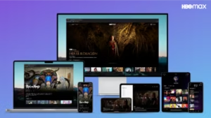
As streamers constantly update their platforms, the changes often feel more like new arrangements than true improvements. Max’s latest overhaul of its navigation menu is no exception—but it does bring a few interesting updates that could improve the user experience.
One of the most noticeable changes is the removal of the top navigation bar that housed essential features like Home, Series, Movies, HBO, B-R Sports, and News. These options have now been relocated to the left-side menu, allowing for easier access without having to move your focus from one side of the screen to the other. It’s a logical shift, though The Streamable notes that it’s essentially the opposite of what Netflix did last year when it moved its main navigation from the left to the top.
Beyond rearranging the layout, Max has added two new categories to its menu: Categories and What’s New. The Categories option allows users to browse content based on genre, brand, or thematic collections—something we’re familiar with from other streaming services like Netflix. While this is nothing revolutionary, it’s a welcome addition that gives users more control over their content exploration.
More notably, the What’s New section is a fresh addition designed to highlight recently added titles as well as those that are leaving soon. This feature serves as a convenient way for users to keep up with the latest content and avoid missing out on titles before they disappear. Reddit users familiar with Max are already pointing out that What’s New feels like a reinvention of the “leaving soon” section from the old HBO Max app, which will be a nostalgic feature for many long-time users.
Max has been trialing this new layout in Latin America, with plans for a global rollout in a phased approach. This strategy ensures that users everywhere will gradually experience the updated design.